

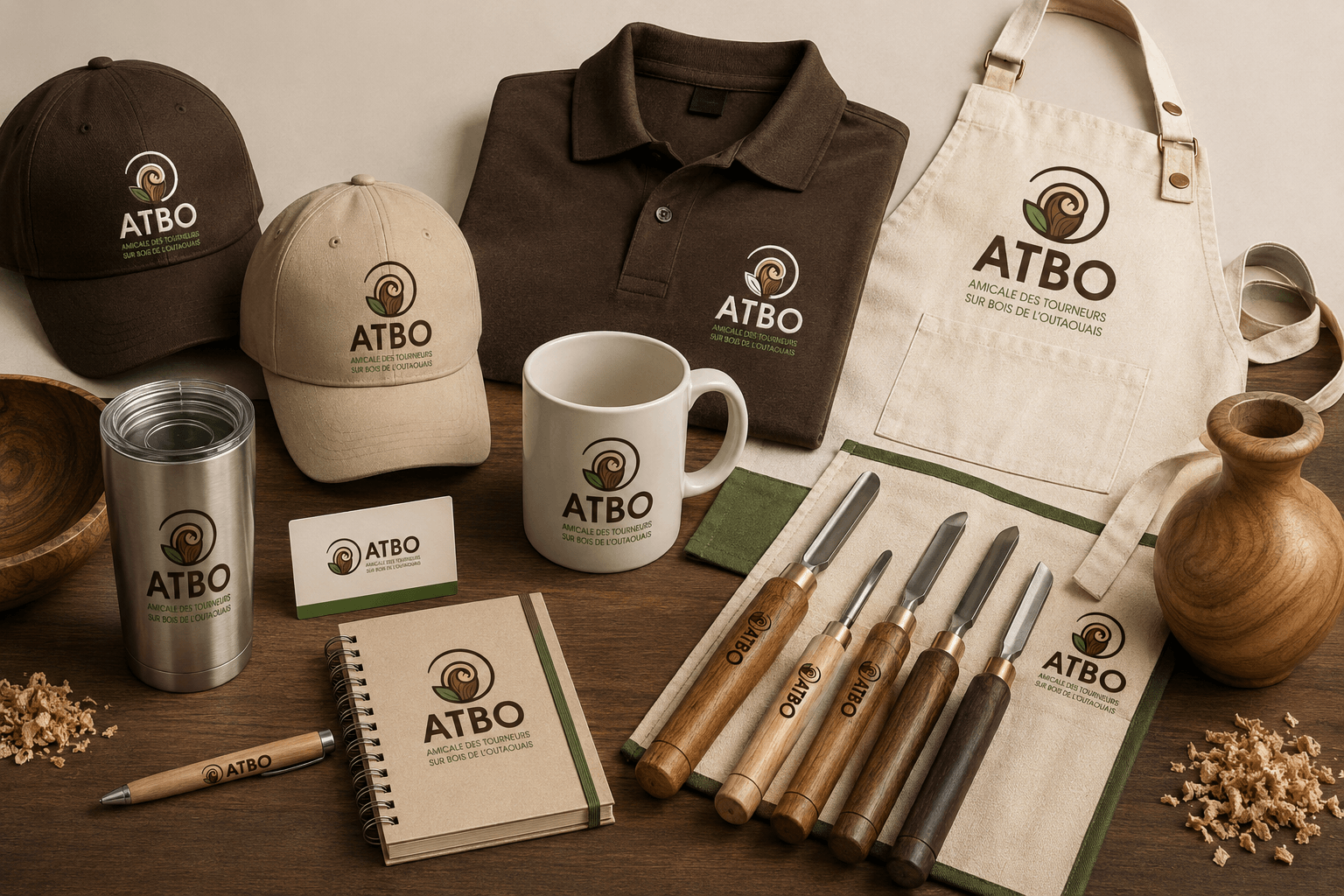
A great logo is more than a symbol—it tells a story. For ATBO – Amicale des Tourneurs sur Bois de l’Outaouais, the brand identity reflects the passion, creativity, and craftsmanship of woodturning while creating a recognizable image that members can proudly represent.
The logo combines a stylized wood shaving with a natural leaf, enclosed within a circular form that symbolizes unity, movement, and the continuous learning shared within the woodworking community. Every element was intentionally designed to communicate the values of craftsmanship, nature, and collaboration. Consistent branding like this helps organizations become instantly recognizable while creating a lasting emotional connection with their audience.
A Colour Palette with Meaning
The ATBO colour palette was carefully selected to reinforce the organization’s identity and the environment that inspires its members.
Deep Brown
Representing solid wood, experience, craftsmanship, and tradition, the rich brown establishes trust while reflecting the natural beauty of hardwood.
Forest Green
Green symbolizes growth, learning, sustainability, and the forests that provide the raw materials for the craft. It reinforces the organization’s commitment to nature and community.
Warm Gold
The golden wood tone represents freshly turned timber, creativity, and the warmth of handmade craftsmanship. It adds energy without overwhelming the brand.
Soft Beige
The neutral beige creates balance and provides excellent contrast across print and digital applications while maintaining an organic, natural appearance.
Together, these colours create a timeless identity that feels authentic, welcoming, and professional. Research consistently shows that colour plays a major role in how people recognize and remember brands, making a carefully chosen palette one of the most valuable assets of any organization.

Why Strong Branding Matters
A professional logo is only the beginning of a successful brand. True branding creates consistency across every customer touchpoint, including:
- Website design
- Social media
- Printed materials
- Apparel and merchandise
- Event signage
- Promotional products
- Email communications
- Business cards
When every piece shares the same visual language, audiences immediately recognize the organization, building familiarity and trust over time. Consistency also makes marketing more effective by reinforcing the same message wherever people encounter the brand.
A Brand That Grows with the Community
ATBO’s identity was designed to support the organization well into the future. Its clean, timeless style allows the brand to evolve while remaining instantly recognizable. By combining thoughtful design, meaningful colours, and consistent application, the organization has a visual identity that reflects the quality of its members’ craftsmanship and the passion they share for woodturning.
At Inter-Vision, we believe every successful brand begins with a strategic foundation. A professionally designed logo and cohesive brand identity do more than look great—they communicate values, inspire confidence, and help organizations stand out in an increasingly competitive digital world. Whether you’re launching a new organization or refreshing an established one, investing in professional branding is an investment in long-term recognition, credibility, and growth.

Leave a Comment: